Case Studies / Titan Self Storage

Titan Self Storage

Titan Self Storage is a storage company providing secure modern storage facilities around the UK for business and personal use.

Titan Storage Web Design & Booking Automation Case Study

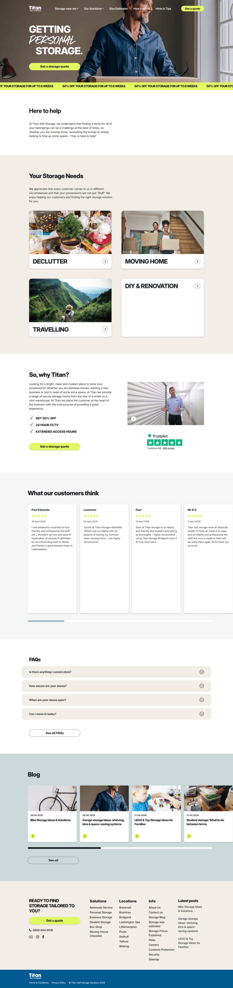
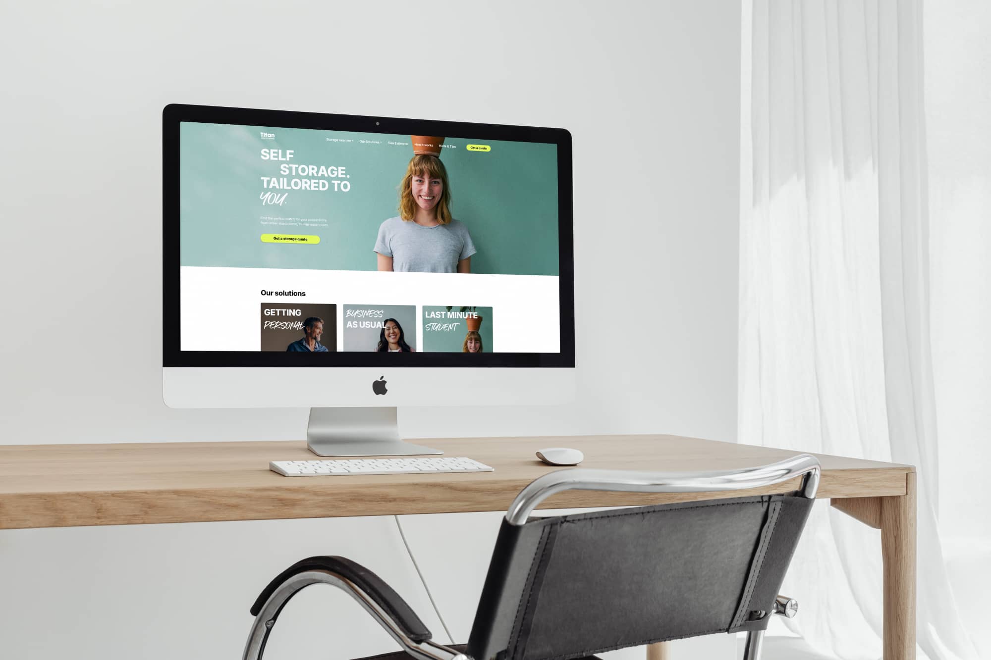
Website Redesign & UX Refresh

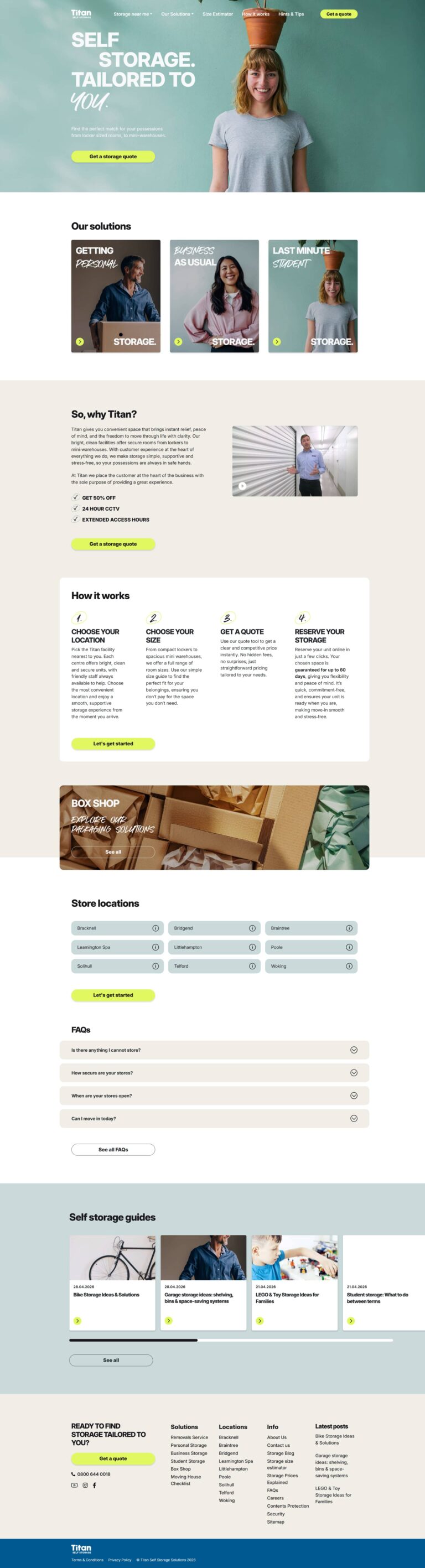
Following our long-term partnership with Titan Self Storage, we collaborated on a full website redesign to modernise the customer experience while retaining the powerful booking and automation system previously developed.

Having already solved the complex technical integrations several years earlier, this phase of the project focused on improving usability, streamlining the customer journey, and creating a more flexible content-managed website to support ongoing marketing activity and future growth.


Collaborative Approach

This project was delivered in collaboration with:

Design: Fireworx
Marketing Strategy: Hoot Marketing
SEO: Gain

Working together, the goal was to create a cleaner, more conversion-focused experience that better reflected the Titan brand while simplifying the path from landing on the site to requesting a quote.


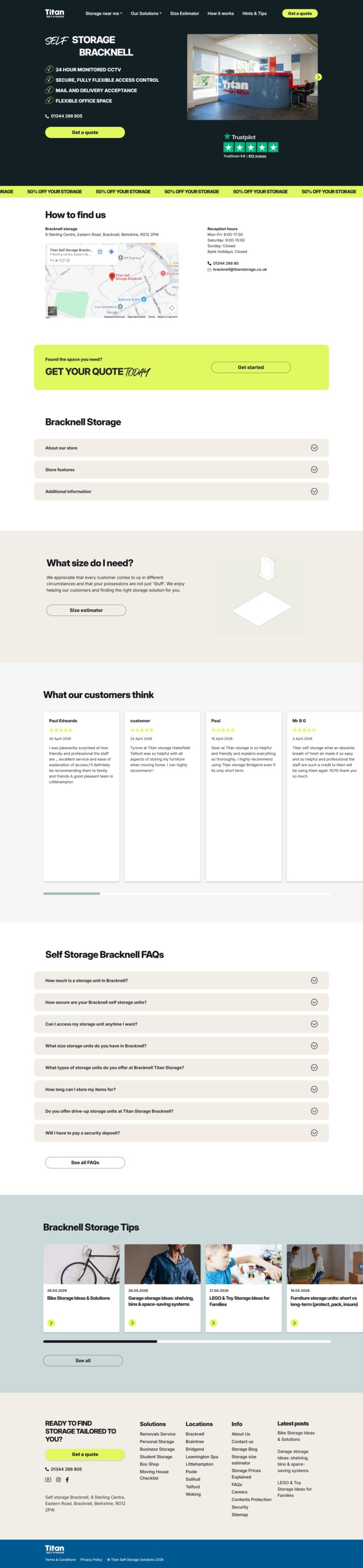
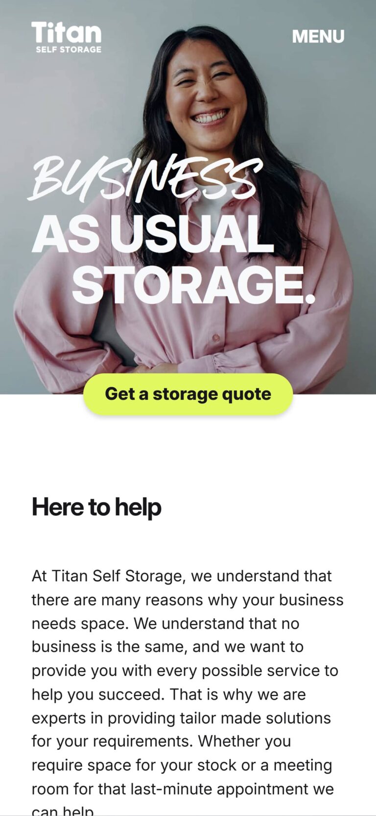
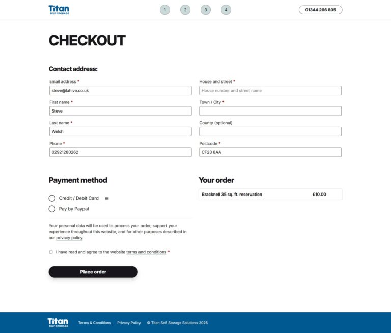
Streamlined Customer Journey

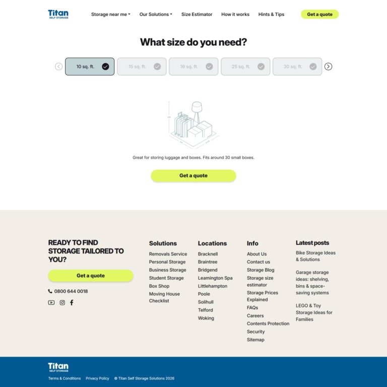
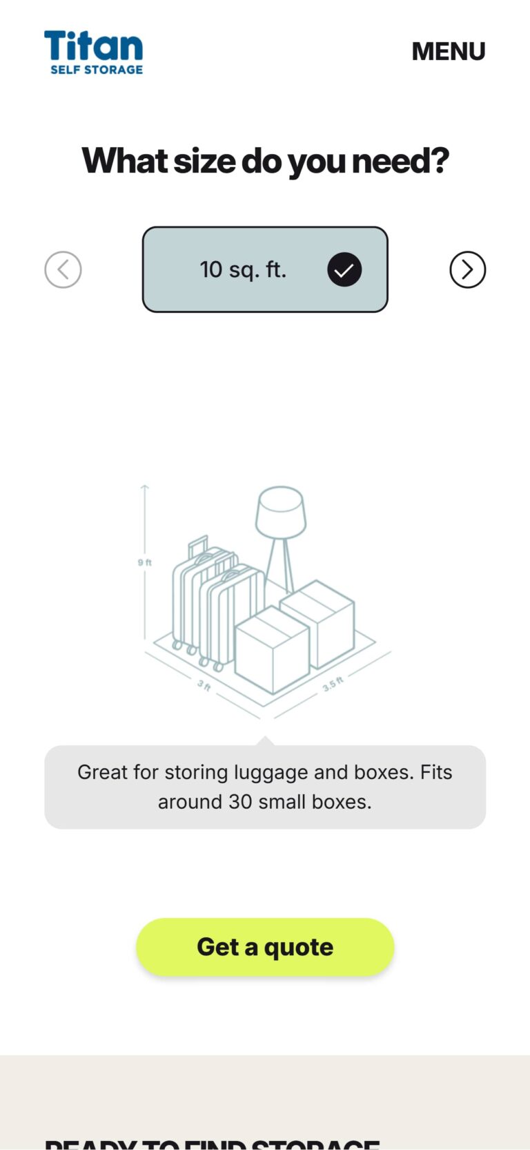
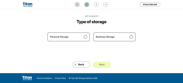
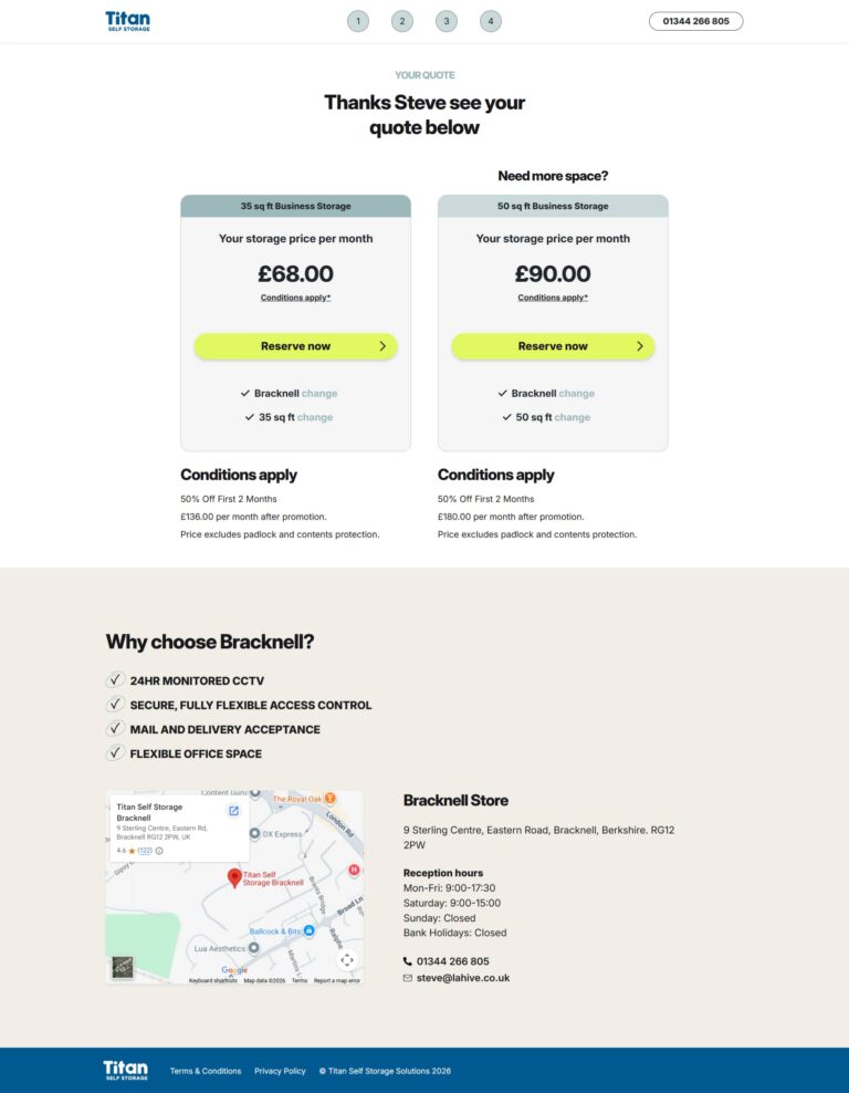
While the underlying integrations with Storman, WooCommerce, and DocuSign remained unchanged, the ‘Get a Quote’ process was redesigned to reduce friction and improve the overall user experience.

Key improvements included:

  • Cleaner, more intuitive quote flow
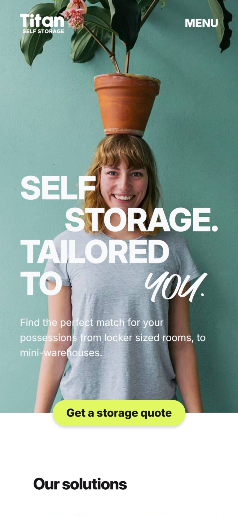
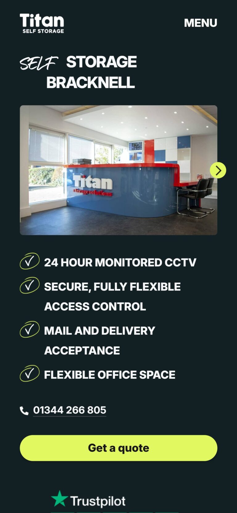
  • Improved mobile experience
  • Simplified navigation and calls-to-action
  • Better visual hierarchy and page structure
  • Faster access to pricing and reservation steps
  • Improved trust-building through reviews, testimonials, and service content

The result is a smoother booking journey that helps customers move through the process more confidently and efficiently.

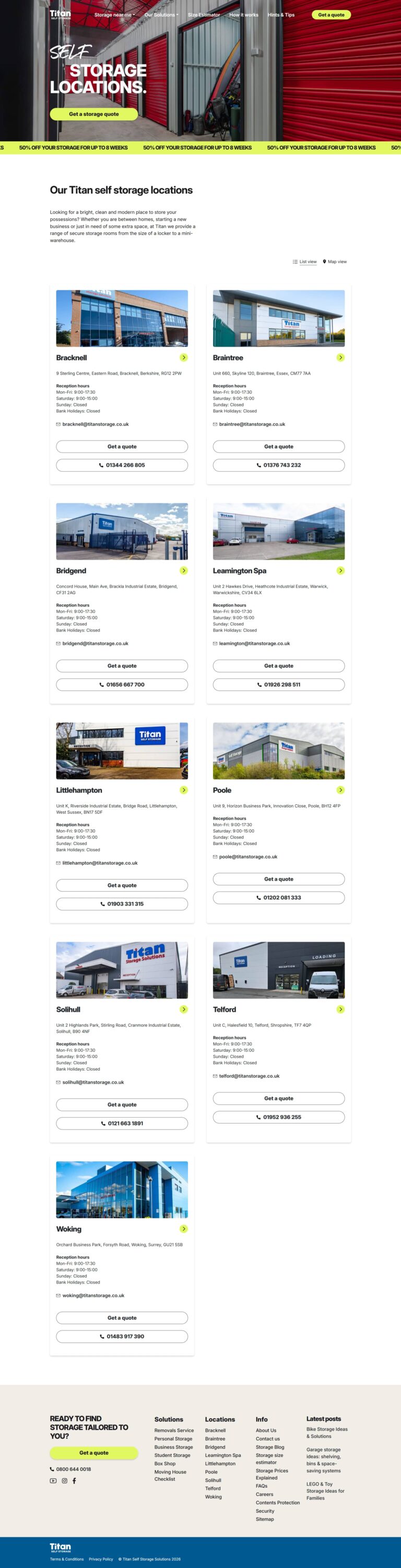
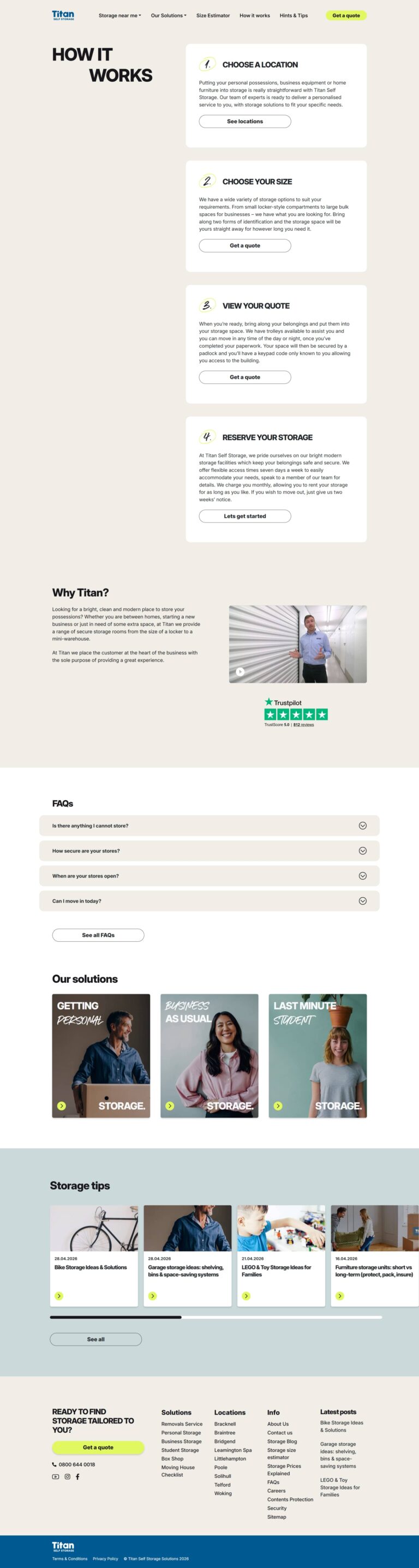
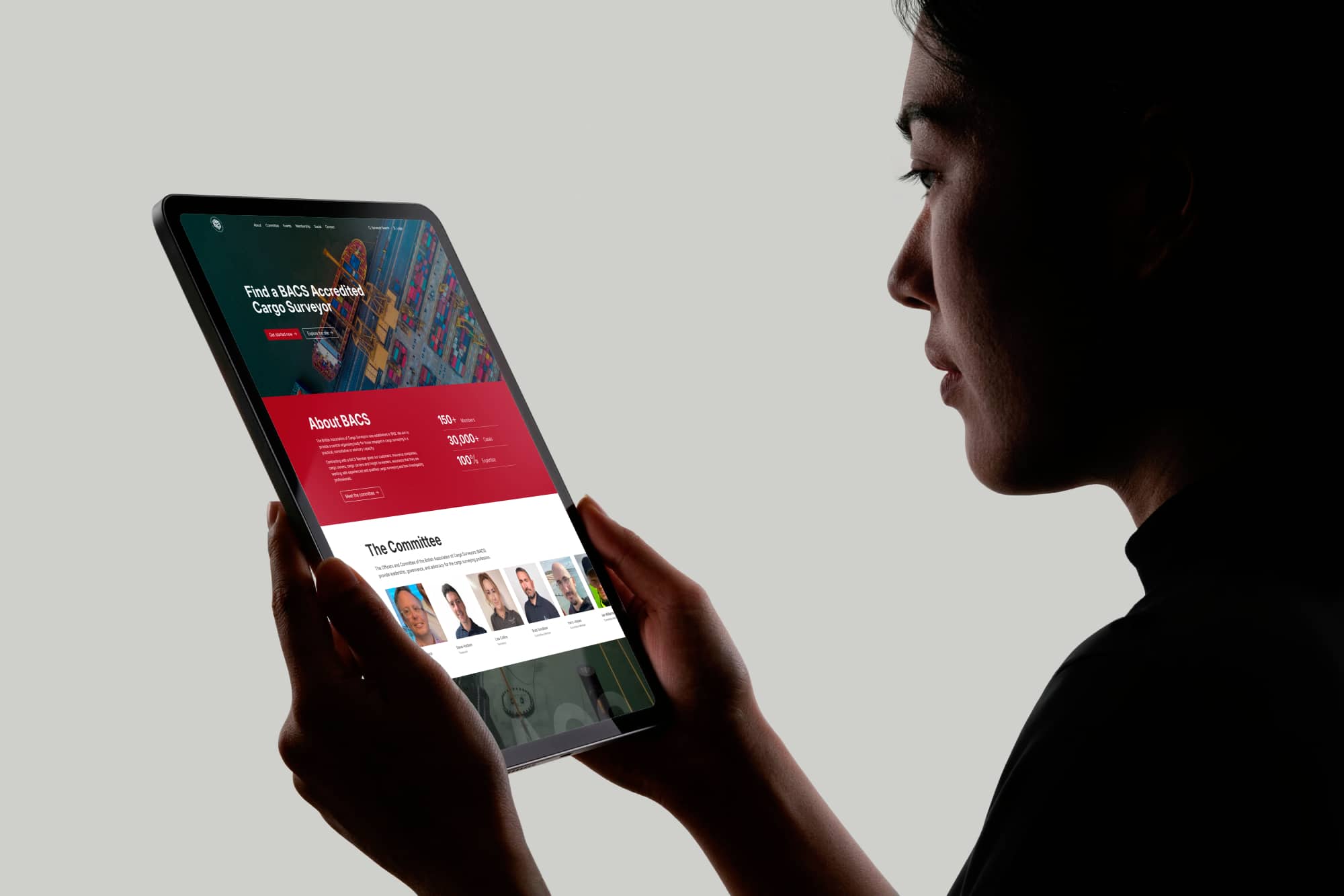
Flexible WordPress Build

The redesigned website was developed using a custom WordPress theme with Advanced Custom Fields Flexible Content layouts.

This modular approach allows reusable sections to be used throughout the site, including:

  • Service content blocks
  • Location-specific content
  • Testimonials
  • Blog posts
  • Trustpilot review sections
  • FAQs
  • Call-to-actions

The flexible layout system makes it easier for the Titan teams to manage and expand the website without requiring custom development for every page update.

Existing Automation Infrastructure

The redesign continues to utilise the bespoke automation system previously developed for Titan, including:

Integration Function
Storman API Real-time unit pricing & availability
WooCommerce Custom Plugin Deposits, reservations & order management
DocuSign Integration Embedded and email-based eSignatures

Customers can still:

  • Get instant quotes
  • Reserve units online
  • Pay deposits securely
  • Sign contracts immediately or later via email
  • Receive signed PDF agreements automatically

All while maintaining real-time synchronisation between systems with minimal manual staff involvement.


Built for Long-Term Flexibility

This isn’t the first time the site has evolved. Around five years after the initial WordPress migration, we carried out a first major refresh to modernise the design and improve usability, while keeping the underlying structure stable. You can see how the site looked and functioned at that stage in the previous case study.


Screenshots

Drag to scroll

The Result

The end result is a modern, conversion-focused self storage booking website that combines seamless user experience with powerful automation behind the scenes, helping Titan deliver a faster customer journey, reduce administrative workload, and support continued business growth through a scalable digital platform.

Case Studies / British Association of Cargo Surveyors

British Association of Cargo Surveyors

A modern, one-page design for The British Association of Cargo Surveyors (BACS) featuring an accredited member directory, streamlined access to industry resources, and improved engagement tools for events and membership benefits — all tailored for cargo surveying professionals.

British Association of Cargo Surveyors (BACS) Website Redesign Case Study

The Challenge

BACS approached us with a traditional, multi-page website that had become fragmented and hard to navigate over time. With key information scattered across separate pages, members and visitors struggled to access content efficiently. The member search directory was outdated, the events section lacked engagement, and the dashboard/resources area needed a usability refresh.

Our goal was clear: streamline the user experience, modernize the design, and retain the association’s authoritative presence in the industry – while improving accessibility for its members.


The Solution

We reimagined the BACS website as a dynamic one-page layout, elegant in form and powerful in function. Each section was designed to tell the BACS story clearly while making navigation intuitive and engaging.

Consolidated Content, Elevated Usability

All key content areas, from About BACS to Contact Us, now live on a single scrollable page, separated by sleek anchor links for smooth transitions. This reduced cognitive load and gave users quick access to relevant information.

Parallax Design with Purpose

We integrated parallax scrolling to create a sense of depth and motion. This not only enhanced visual appeal but also guided users naturally through the site, making it a modern browsing experience without compromising clarity.

Interactive Committee Gallery

A dedicated Committee Members section features thumbnail photos that link directly to each member’s full profile in the updated member directory – bridging static visuals with dynamic content in an intuitive way.

Events Preview with Full-Page Extensions

We highlighted the top three BACS events with eye-catching thumbnails. Each thumbnail opens into a dedicated full-page event detail, blending the one-page aesthetic with deeper content where needed.

Revamped Member Directory

The member directory was fully overhauled to improve searchability and readability, with a sleek new interface and enhanced filtering options. Profiles are cleaner, better structured, and easier to navigate.

Modern Member Dashboard & Resource Hub

We transformed the member dashboard and resources area into a streamlined interface that helps BACS surveyors quickly access documents, updates, and association tools, ensuring the backend experience is as refined as the public site.

Affiliated Member Showcase

A dedicated Affiliated Members section now features scrolling logos, giving recognition to partner organizations while adding a kinetic element to the page’s flow.

Mobile-Optimized and Performance-Focused

The entire site is responsive, fast, and optimized for mobile users—crucial for BACS members in the field accessing data on the go.


Screenshots

Drag to scroll

The Result

The BACS website redesign is a testament to how form and function can work together to elevate a brand. By merging modern web design trends with practical member-focused solutions, we’ve delivered a digital presence that reflects BACS’s authority, community, and forward-thinking vision.

Case Studies / International Institute of Marine Surveying USA

International Institute of Marine Surveying USA

The International Institute of Marine Surveying USA branch, promotes the practice of marine surveying throughout the USA with the support of the IIMS Head Office in the UK and its resources.

best website awards

The Challenge

The International Institute of Marine Surveying (IIMS) USA needed a website that reflected its global authority while addressing critical issues:

  • Outdated UX: Poor mobile responsiveness and high bounce rates (avg. 65%).
  • Fragmented Content: No centralized hub for training, member resources, or industry updates.
  • Weak SEO: Low visibility for key terms like “marine surveyor certification USA.”

Goal: Build a user-friendly, brand-aligned site to boost engagement, streamline member access, and strengthen IIMS’s US presence.


Our Approach

01. Strategic Brand Alignment

  • Adopted IIMS’s global visual identity (navy/white palette, clean typography) while tailoring content to US audiences.
  • Integrated the IIMS Code of Conduct prominently, reinforcing professionalism.

02. Technical Modernization

  • Platform: Migrated to WordPress + Bootstrap 5 for faster load times (~2s avg.) and mobile optimization.
  • Key Features
    • Dynamic RSS Feed: Auto-syncs news/training updates from IIMS HQ (UK) to ensure real-time accuracy.
    • Member Portal: Secure login for CPD tracking, event registration, and directory access.
    • Search Optimization: Structured data markup and localized keywords improved organic traffic by 40%.

03. User-Centric Design

  • Simplified navigation with dedicated sections for Training, Membership, and Industry Resources.
  • Added interactive tools: Local and international surveyor search.

Screenshots

Drag to scroll

The Results

  • Engagement: Avg. session duration increased from 1.5 to 3.8 minutes.
  • Membership Growth: 25% more sign-ups YOY post-launch.

This project succeeded by balancing fast, scalable infrastructure with member needs for easy access to resources. The redesign positioned IIMS USA as a modern, member-first organization – mirroring its global standards while serving local demands.

Case Studies / Pantheon Poets

Pantheon Poets

Pantheon Poets is an online collection of recited Latin poems with accompanying Latin text and English translation.

Pantheon Poets is a WordPress educational platform for Latin poetry enthusiasts.

The Challenge

Pantheon Poets sought to bridge ancient and modern worlds by creating a definitive digital resource for Latin poetry – designed for those without Latin proficiency.

Core Requirements:

  • Accessible Translations: Side-by-side Latin texts + literal English translations.
  • Auditory Learning: High-quality audio recordings of recited poems.
  • Scholar-Grade Curation: Structured archives by poet, era, and theme.

The Approach

01. Architecture for Discovery

  • Custom WordPress Build:
    • Poet & Poem Post Types: Organized with taxonomies.
    • Dynamic Linking: Auto-generated connections between poets and their works.
    • Minimalist UI: White space and restrained red/black accents to spotlight poetry.

02. Speed & Accessibility Optimizations

Feature Solution Impact
Audio Hosting HTML5 player Zero buffering for global listeners
Responsive Typography Relative units (rem) Readability on all
Image Optimization WebP format + lazy loading Faster page loads
CSS/JS Minification Combined + compressed static assets Render-blocking time reduced
.htaccess Optimization Caching rules + Gzip compression Repeat visits 2x faster

03. Design as a Silent Guide

  • Color Palette:
    • Reddish-grey backgrounds: Soft contrast for text legibility.
    • Black/red accents: Echo classical manuscript aesthetics.
    • Hierarchy: Poet bios → poems → audio player (linear learning flow).

Screenshots

Drag to scroll

The Result

  • Adopted by the Classical Association as a teaching resource.
  • SEO Success: Top rankings for “Latin poetry with translations”.
  • Auditory + Visual Learning: Audio recordings made Latin tangible for non-speakers.
  • Scholarly Rigor, Modern UX: Trusted by academics but approachable for students.

A classy, easy to use site that is a great resource for Latin poetry.