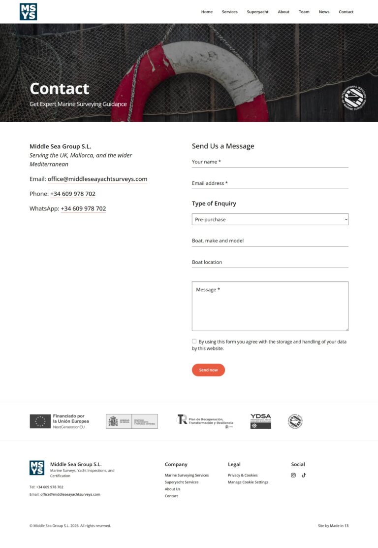
The Challenge
Middle Sea Yacht Surveys had an existing WordPress website built with the Elementor page builder plugin, but it was no longer supporting the business effectively.
The previous site had several issues:
- Poor visibility in Google search results
- Slow loading speeds affecting user experience
- Inconsistent page structure and scattered information
- Generic presentation that didn’t reflect the quality of the business
- Lack of confidence when sharing the website with prospective clients
For a specialist marine surveying company working with yacht owners, brokers, and commercial clients, first impressions matter. The website needed to look credible, load quickly, and clearly communicate expertise.
Project Goals
- Replace the existing Elementor site with a faster custom-built solution
- Improve Google rankings for relevant marine surveyor search terms
- Reorganise content into a clearer, more professional structure
- Build a website the client would be proud to share
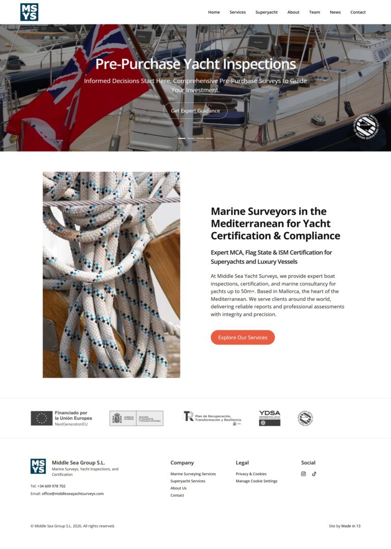
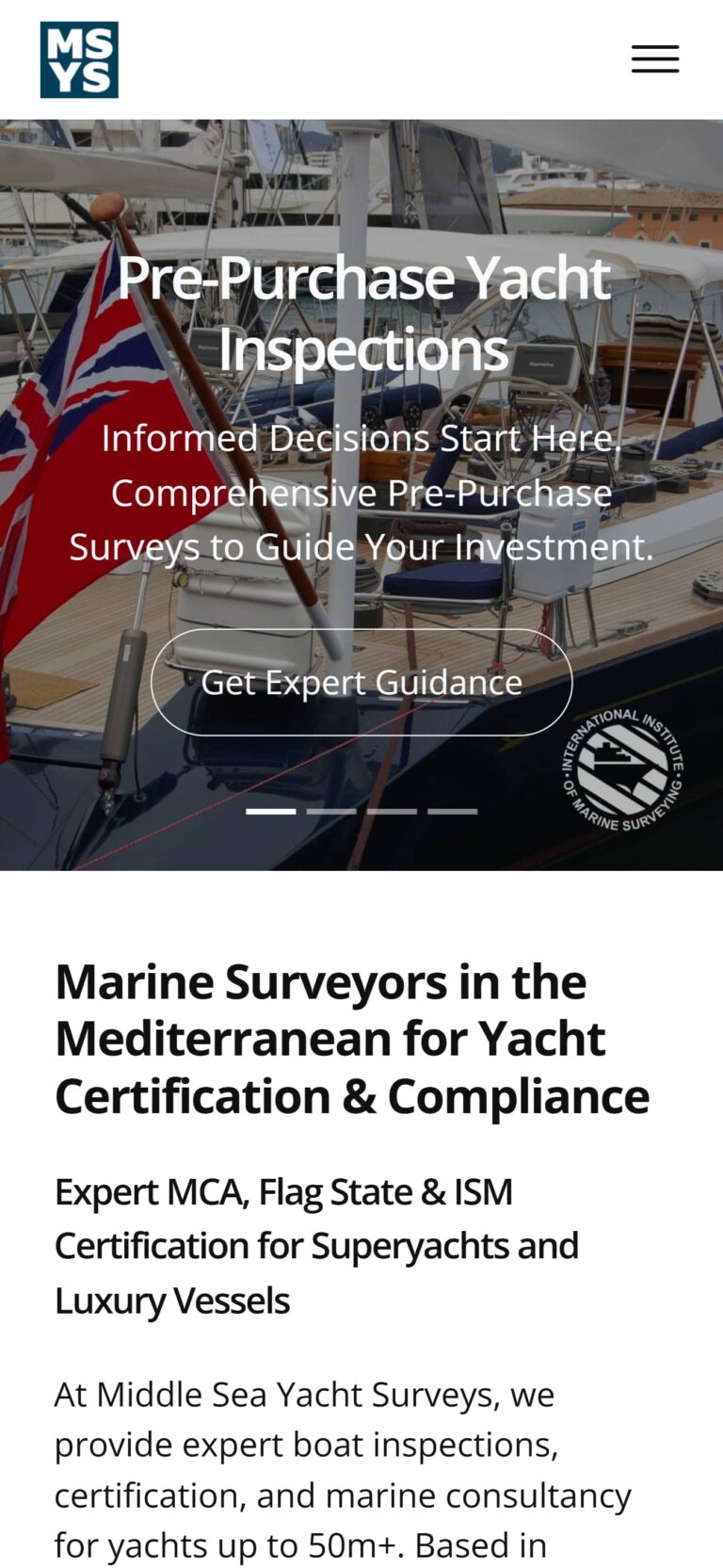
The Solution
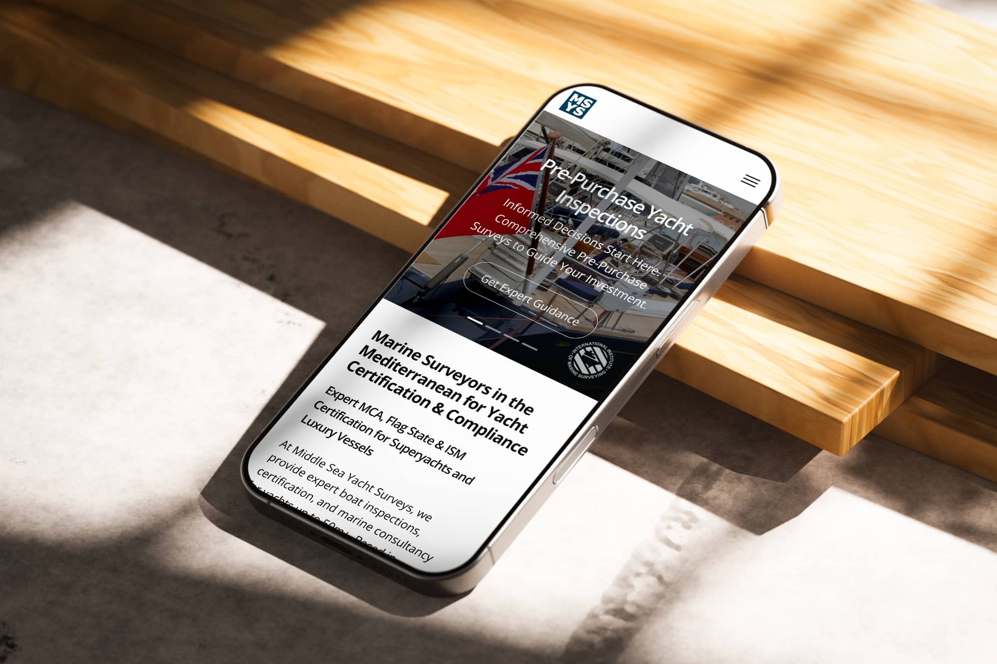
We rebuilt the website from the ground up using a custom WordPress theme designed for speed, performance, and long-term SEO growth.
The new website was developed using:
- Custom lightweight WordPress theme
- Advanced Custom Fields Flexible Content page builder
- Reusable content sections for easy future expansion
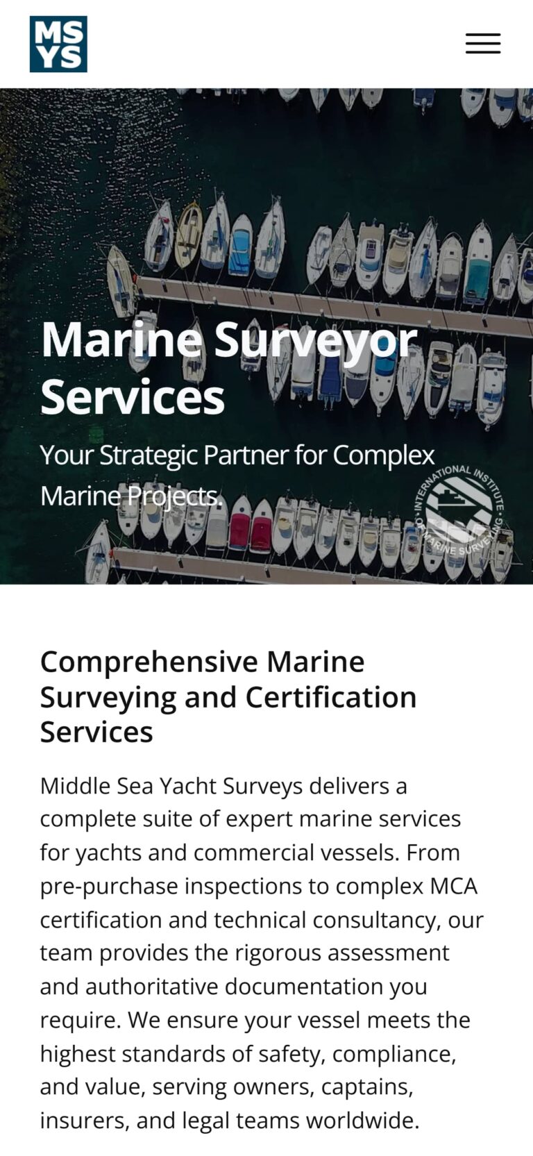
- Mobile-friendly responsive design
- Performance-focused codebase for faster load times
This removed the overhead of Elementor and gave the client a much faster, cleaner website.
Industry-Specific Content Strategy
Because we have experience building websites for marine surveyors, we understand the terminology, customer concerns, and services buyers are searching for.
This allowed us to restructure the content using language relevant to:
- Pre-purchase yacht surveys
- Insurance surveys
- Valuations
- Condition reports
- Mediterranean yacht owners and buyers
- Brokers and marine professionals
The result was a more authoritative website that better reflects the expertise of the business.
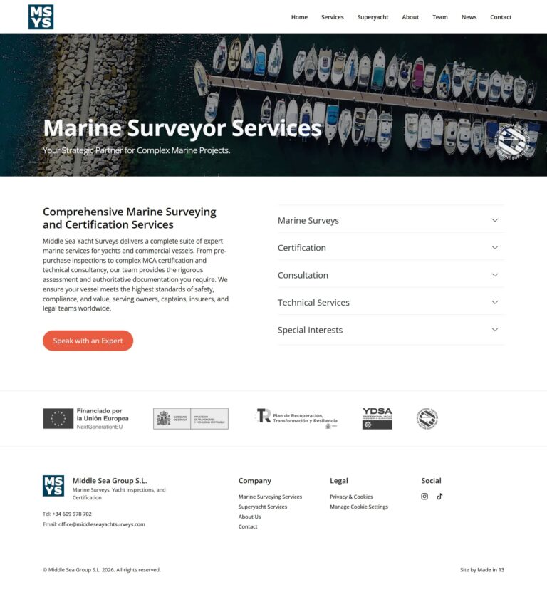
SEO Growth Framework
Alongside the redesign, we developed a secondary SEO-focused page layout for individual services.
At the moment, the client’s services are summarised on a single core services page. To support future search growth, we created a flexible template that allows dedicated service pages to be added over time.
This gives the business a clear path to expand its visibility for specific search terms such as:
- Pre-Purchase Yacht Surveys
- Insurance Yacht Surveys
- Valuation Reports
- Condition Surveys
- Mediterranean Yacht Survey Services
Benefits of the New SEO Layout
- Ability to target individual service keywords
- Better long-term organic growth opportunities
- Easier expansion as services evolve
- Stronger internal linking structure
- Consistent branding and page design